New Kellogg Signature Identity
In collaboration with the Kellogg Europe marketing team, Loop Brands has created the new Kellogg Signature identity and range. Shaping a new vision of the Kellogg portfolio.
It’s one of those pinch yourself moments to be contributing to a historic globally renowned brand such as Kellogg. Families have been waking up to their iconic cereals for generations. Our challenge was to restore the forgotten history and motivate consumers to reappraise the brand.
Kellogg’s history can be dated back to 1906, as can the master brand logo, which since then has only received occasional minimal changes. The new signature identity is the most significant update in it’s history, playing a pivotal role in shifting perspectives towards a healthier approach to food. The identity signifies the beginning of a new chapter, a new future and a new business direction.
The founder himself, Will Keith Kellogg, was one of the first to revolutionise breakfast as we know it. Going out alone he founded the Kellogg Toasted Corn Flake Co in 1906 and to differentiate his flakes from other fierce competitors he added his own signature to each box of Corn Flakes. This later developed into the company logo as we know it today.
Studying the history, we referenced the original Kellogg signature from the 1900‘s as well as the various iterations of identities that had been created.
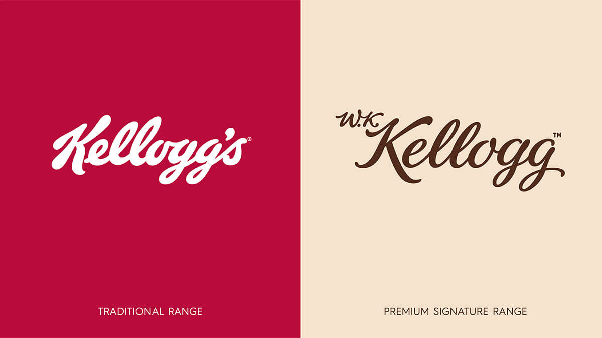
Strategically we wanted to create an identity that looked forward with a modern expression of the signature rather than a retrospective clichéd nod to the past. With the help of typographer, Keith Morris, we explored endless versions and revisions of the new signature identity. The letter forms were inspired by looking at the marks made by a traditional fountain pen. Refining the thick and thin form in the identity was a major step in moving away from the mainstream Kellogg mark that everyone recognises. W.K. was added to restore the hallmark of being the ‘original’.
The significant change to reinvent this Kellogg portfolio was to depart from the synonymously recognised red colour. This could be viewed by traditional marketeers as sacrilege, however the decision was made to rule a line between the traditional Kellogg portfolio and a progressive new ‘signature’ portfolio. The new identity signals a disruptive mindset and business approach to evolve and challenge itself. Reappraising all aspects of the brand internally and externally as an example of what is possible and to not rest on ones laurels.
The result is a modern and sophisticated interpretation of the original signature mark that embodies craft and authenticity. With the founder taking centre stage once again, 2018 will see this identity being rolled out across Europe in brand communications and packaging design for their cereals, granola & snack products.
